- Introduction
- How does it work?
- Appearance of Breadcrumb
- Breadcrumb Radius (px)
- Breadcrumb Active Background Color
- Breadcrumb Inactive Background Color
- Breadcrumb Number Icon Active Color
- Breadcrumb Number Icon Inactive Color
- Breadcrumb Title Active Color
- Breadcrumb Title Inactive Color
- Breadcrumb Actions Active Color
- Breadcrumb Actions Inactive Color
- Breadcrumb Show/Hide Icons
- Hide Border
- Fixed Navigation Step
- Text for Change Action
- Breadcrumb prefix text
- Wrap title on mobile
- Header Font Family
- Step Number Font size
- Header Font Size
- Icon Size
Introduction #
How does it work? #
This section is used for customizing the styling and look & feel of the Breadcrumb{Learn more} for any pair builder{Learn more} (e.g Ring Builder for pair maker).

Please refer to the following video for more details:
Appearance of Breadcrumb #
Breadcrumb Radius (px) #
Value in this field will be used to customize the corner radius of the Breadcrumb border. It supports Pixels values only. Be sure to append “px” at the last.
Admin Panel #

Output #

Note:- Below you will find mention of active and inactive breadcrumb fields. Active means the step on which the user presently is on and the rest steps are considered inactive. So, here you can customize fields for active and inactive breadcrumb steps.
Breadcrumb Active Background Color #
You can use this field to customize the background color of the active Breadcrumb step.
Admin Panel #

Output #

Breadcrumb Inactive Background Color #
You can use this field to customize the background color of the inactive Breadcrumb step.
Admin Panel #

Output #

Breadcrumb Number Icon Active Color #
You can use this field to customize the Icon color of the Breadcrumb active part.
Admin Panel #
Output #

Breadcrumb Number Icon Inactive Color #
You can use this field to customize the Icon color of the Breadcrumb inactive part.
Admin Panel #
Output #

Breadcrumb Title Active Color #
You can use this field to customize the Title color of the Breadcrumb active part.
Admin Panel #

Output #

Breadcrumb Title Inactive Color #
You can use this field to customize the Title color of the Breadcrumb inactive part.
Admin Panel #

Output #

Breadcrumb Actions Active Color #
You can use this field to customize the Action color of the Breadcrumb active part.
Admin Panel #

Output #

Breadcrumb Actions Inactive Color #
You can use this field to customize the Action color of the Breadcrumb Inactive part.
Admin Panel #

Output #

Breadcrumb Show/Hide Icons #
If you enable this field then it will show Breadcrumb Icons on the front-end. Disable it, if you want to hide Breadcrumb Icons from the front-end.
Hide Border #
If you enable this field then it will hide the Breadcrumb border on the front end.
Fixed Navigation Step #
Enable this option if you want to keep fixed order of steps’ navigation in pair builder {Learn More} e.g. in the ring builder you may want to show Diamond step always as step number 1 no matter even if the user starts with setting then the user will be loaded to setting step but it will be presented as the second step on UI of your website.
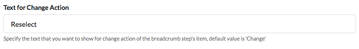
Text for Change Action #
Value in this field will change the name of the “change” action of the breadcrumb step’s item.
Admin Panel #
Output #

Breadcrumb prefix text #
Value in this field is used to set prefix words on the breadcrumb, by default ‘Choose a’.
Admin Panel #

Output #

Wrap title on mobile #
If you enable this field then it will automatically wrap the large title in the breadcrumb steps for the mobile view.
Header Font Family #
Value in this field will be used to change the font family of the breadcrumb heading. Be sure to specify the exact font family name.
Admin Panel #

Output #

Step Number Font size #
Value in this field defines the size of the step number in the Breadcrumb Header. It supports Numeric values only.
Admin Panel #

Output #

Header Font Size #
Value in this field will be used to change the font size of the heading. It supports Numeric values only.
Admin Panel #

Output #

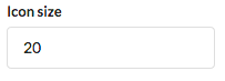
Icon Size #
Value in this field defines the size of the Icons in the Breadcrumb Header. It supports Numeric values only.
Admin Panel #
Output #


